HOMEABOUT USSHOP HERECROPDATESCURRENT CHALLENGESTIPS&TUTORIALS

Monday, January 30, 2017

Believe in Yourself layout by Rachel Lowe:


Happy Monday everyone.

I can't believe January is almost over!

Today I am using Bella BLVD Bright and Brave collection.

Although it has religious connotations it can be used easily to create 'positive' and 'loving' layouts. 

I have gone bright and bold with this layout.

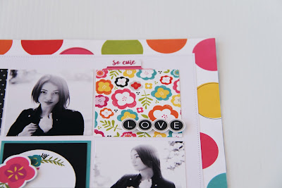
I am a huge fan of grids as you can use each square to create embellishment/feature clusters.


I have used the bright multi coloured circle paper as my background.

I then cut my white cardstock down to 10x10 inches.

I have sewn the edges of the white card to add another border.


I then cut down the journal card paper down to 3x3 inch squares to go with the theme of my photos.

I have chosen three photos of my daughter and cut them down to 3x3 inches also. 
Grid layouts are also a great way to create multi photo layouts.


With each square I have embellished with the die cuts and stickers from this collection.


I have sewn on some of the squares and used foam tape to create height on others.

Once I was happy with each square I then attached measuring to ensure my grid was aligned.


This layout is all about colour and embellishment placement.

Thank you for stopping by today and see you in February!


Photobucket

Friday, January 27, 2017

Just Adorable
by Tammy Klingner

Good morning everyone
 
Well as the school holidays come to an end, I'm here to share another bright, fun layout.
 
This ones about my teenage girl and I.
 
I used Simple Stories Whatever Simple Set. 
I teamed it with some of my leftovers from Amy Tangerine Oh Happy Life as these just co-ordinate so well!
As soon as I saw it I knew it was perfect for my teen girl and I. 
It contains really cool sayings like 'whatever' 'ummno'.
Things we actually say in our everyday life.
 
I started with white bazzill.
I applied white gesso fairly randomly across the page.
I then added some swipes of Dylusions paint in the centre of the page.
Once dry, I randomly flicked some black paint over the page.
 
 
I love the papers in the Simple Stories set - so ME with some colour plus black and white.
I tore a few strips of papers and added these to the left hand side of my layout, poking little tabs inbetween.
I also stapled some twine to these strips to create some texture and interest.
 
I also added some small strips to the right hand side of the layout.
 
 
I then bordered my photos and added these with a few strips of paper underneath.
 
I added some stickers to the layout and then added my 2Crafty title, painted black.
 
 
The final step was to write my journaling.
 
I really enjoyed creating this fun layout about my gorgeous teen girl and I and our attempt at selfies.
 
See you next week!
 
Products used:
Simple Stories Whatever Simple Set
Amy Tangerine Oh Happy Life Little Moments Paper
Amy Tangerine Oh Happy Life All Smiles Paper
2Crafty Chipboard Just Adorable
Dylusions Paint - Black Marble
Dylusions Paint - Polished Jade
Simple Stories Life in Color Stickers
Twine - Charcoal
White Bazzill 
 
 
Photobucket

Wednesday, January 25, 2017

Life is Always Better with Dylusions
and Jillibean Hardy Hodgepodge
by Fiona Johnstone

Hello everyone

This week I am sharing my class page from the weekend, created using Dylusions Paints and Jillibean Soup Hardy Hodgepodge collection. 

Life is Always Better When we are Together


Lots of fun in class getting messy with our hands and some baby wipes to created this fun mixed media background using Dylusions paints. 


After that I have layered up several papers and added some detailing with white
 Dylusions paint and an old store/credit card. 


I've used Jillibean Soup - Hardy Hodgepodge Label Stickers to embellish and frame
 my photo and finished off the embellishing with some 2Crafty Chipboard
 and Green Tara flower.
  I kept all embellishments on the patterned paper so as not to detract from the effect
 of the painted background. 


Thanks for stopping by
Till next week
Fiona
x
Photobucket
Product List:
Jillibean Soup Hardy Hodgepodge Paper - Handful of Hearts
Jillibean Soup Hardy Hodgepodge Paper - Pinch of Plants
Jillibean Soup Hardy Hodgepodge Paper - Trace of Triangles
Jillibean Soup Hardy Hodgepodge Paper - Pounds of Pups
Jillibean Soup Hardy Hodgepodge Label Stickers
Dylusions Paints - Lemon Zest
Dylusions Paints -  Fresh Lime
Dylusions Paints - Pure Sunshine
Dylusions Paints - Vibrant Turquoise
Dylusions Paints - White Linen
2Crafty Chipboard Lattice Leaves
Green Tara Azalea White

Monday, January 23, 2017

Cheeky Layout by Rachel Lowe:

Hello scrappy friends!

Today I have another boy layout for you using Photo Play My Imagination collection.

I have used a photo of my oldest son thumbing my layout for a slightly older boy (last week it was all about a toddler!) and oh that smile!


Firstly I cut two large black scallop borders from black cardstock.

I then cut a 5 inch strip from the blue robot paper and before attaching I place the black scallop border under, at the top and bottom opposite sides for visual interest.

I then attached my photo only taping the top and bottom of the photo allowing me to tuck elements under the photo. I have used a small red lego sticker as washi tape at the top, left of my photo.


I then set about choosing stickers to suit any older boy.
To the left of my photo I foam taped the robot sticker and used from my stash a brad which I think adds another layer. I then tucked under the robot the Cool Dude speech bubble.


On the right side of my photo I attached the yellow sticker photo frame and then foam taped the 'modern technology' robot on an angle. I finished off attaching some of the star stickers.


I cut down one of the journal cards which went with my theme/photo (there are plenty of others to choose from) and added sewing to the top and bottom so it didn't look so flat. I then attached in the centre on my white base paper. To draw your eye to it I added a star and paper plane sticker in red.


Lastly I inked the 2crafty chipboard word 'Cheeky' (don't you just love the font!)
in denim blue  and attached over my photo.

Well thats it using this collection but as you can see you can create some fun boy layouts.

Thanks for stopping by and see you next week where it is all about a girl!

xXx


Photo Play - My Imagination element sticker sheet
Photo Play - My Imagination paper clever
Black Cardstock 12x12
White Cardstock 12x12
2Crafty Chipboard - Cheeky
Photobucket

Friday, January 20, 2017

More of this please
by Tammy Klingner

Happy Friday everyone!!
 
This weeks layout is a bright and happy one.
 
 
For those who know my work you will know I am a big fan of colour!
I always seem to pair it with black.
 
I've done it again in this layout.
This layout uses bits and pieces from Amy Tangerine's Oh Happy Life.
 
 
I began with white cardstock, and applied a layer of white gesso.
This is a very important step - as you need the colour you add to sit on top of the paper.
If you miss this step, your background will absorb the liquid and you won't be able to achieve the desired effect,
 
The inspiration from this layout came from the 'happy' strip in a gradual rainbow of colour.
I used this as a guide when using my spritzes, as I wanted the colours to follow that pattern.
I still managed to muddle it up! LOL
However, instead of starting again I just went with it.
 
So I selected a few colours to spray, and started on the left hand side of my layout.  I spritzed some colour, and then spritzed water on top of this to create a 'run' in the colour. 
I held it up letting it run down the page.
I moved straight to the next colour, without letting it dry inbetween as I wanted the colours to blend together.
 
Once I'd moved across the entire page, and then allowed it all to dry,  I added a few strips of paper to the top of the page. 
I bordered my photos with black and then each one in a different co-ordinating paper.
I added these to my layout with foam tape.
 
 
I then fussy cut my title from one of the papers and added this also with foam tape.
 
I then stamped tiny arrows/play symbols randomly across the painted surface, ensuring they pointed inwards towards the centre of the layout.
I added a few flicks of black paint too.
 
 
I finished off with some 2Crafty arrows which I painted black.
I also cut some arrows from a paper, plus a quote and added these too.
 
Finally, and most importantly I added my journaling.
 
That's it from me for this week!
 
Products used:
Amy Tangerine Oh Happy Life A Great Day Paper
Amy Tangerine Oh Happy Life Crazy Fun Paper
Amy Tangerine Oh Happy Life Good Morning Paper
Amy Tangerine Oh Happy Life Sweet Things Paper
Amy Tangerine Oh Happy Life Little Moments Paper
Crate Paper Cool Kid Buddy Paper
Bella Boulevard Alex Tabs
White Bazzill
Black Bazzill
Dylusions Black Marble Paint
2Crafty Assorted Arrows
Heidi Swapp Pink Colorshine
Dylusions Ink Spray - Polished Jade
Dylusions Ink Spray - Postbox Red
Dylusions Ink Spray Lemon Zest
Kaisercraft Texture Stamp - Edges
White Gesso
 Black
 
Photobucket

Wednesday, January 18, 2017

Magic with Carte Bella's Metropolitan Girl Collection by Fiona Johnstone

Hello everyone

This week using Carta Bella's Metropolitan Girl collection. When I first spotted this collection, I knew it would be perfect for one of my Eiffel Tower photos:

Magic
 
 
A layout with some clean lines this week.
 For my background I have used patterned paper with a fine print so the
 background isn't to plain.

 I have layered some co-ordinating papers from the Metropolitan Girl collection 
and focused on using parts of the papers that focused on Paris - the paper strip
 of Parisian shops from the border strips and fussy cut the Carte de Paris
 from the map paper. 
 
 
I've kept my embellishments clean and simple - the CVS flowers are just beautiful
 and worked perfectly with the patterned papers. A little bit of wood veneer for a
 title and a heart for Paris. 

On the second close up, I've added a Flutterby Designs Flair featuring a camera 
and a cute resin flower to finish off my page. 
 

Thanks for stopping by
Till next week
Fiona
x
Photobucket
Products Used:
Carta Bella Metropolitan Girl paper - Girls and Cities
Carta Bella Metropolitan Girl paper - Journaling Cards
Carta Bella Metropolitan Girl paper - Shopping Cities
Carta Bella Metropolitan Girl paper - Border Strips
Cocoa Vanilla Studio Endless Summer Blooms
Cocoa Vanilla Studios Make a Wish Bits & Pieces
Simple Stories Say Cheese II - Wood Veneers
Flutterby Designs Flair

Monday, January 16, 2017

Imagine Layout by Rachel Lowe:

Hello lovely people and welcome back to another week of scrapping inspiration from us 
All About Scrapbook girls.

I am a huge fan of Bella BLVD and have been thrilled that my last five layouts created for All About Scrapbooks using Bella BLVD have been reposted by them on Instagram and Facebook!

So today I have used Illustrated Faith Bright and Brave collection.

My daughter is very photogenic (ok I am biased!) but I wish she would smile more in her photos! I suspect however I am lucky my children even allow me to take so many photos in the first place!


Firstly I hand punched some butterflies using the red spot paper, I then did another batch using vellum.

I the cut a 5 inch circle and attached to the centre of my white base paper.

I have tried to create the illusion of the butterflies flying upwards and away in my placement.

I used the vellum to soften and create the illusion of moving wings.


I then attached my photo onto a black paper piece creating a polaroid size/shape.

I then attached this off centre with foam tape. I then tucked under a tab finished off with a small black paper heart.


I then set about choosing the paper die cuts that went with my picture/theme.

I added two hearts (one a die cut and one a sticker) to the red speech bubble die cut and attached to the left of the circle.

To the right I have attached the typewriter. The printed word on the typewriter did not go with my theme so I foam taped a sticker over it finished off with two heart stickers. I finished off tucking a floral sticker just under the typewriter.

My title 'imagine' is a word left over from a fancy pants design team kit that ended up in my stash but here you could put any small relevant word title. 


Don't be afraid to mix up your colours and shape, it makes it all the more interesting and in this case a super pretty girl layout.

Thanks for stopping by and not forget to pop back on Wednesday and Friday to see Fiona and Tammy's gorgeous creations!

xXx


Photobucket

Friday, January 13, 2017

Light
by Tammy Klingner

 
Good morning everyone.
 
Today I'm sharing my layout about my One Little Word for 2017.....Light.
 
 
Each year I participate in Ali Edwards' One Little Word.  For more information go HERE.
 I select a word each year as a guide, as something to focus on and keep me grounded.
This year it's Light.
 
If you would like to read more about why I selected that word, you can go to my blog post HERE.
 
This page consists of lots of layers.
 
 
I really wanted to add some journaling, so I didn't do any mixed media on this layout!
I know!
Amazing!
 
I added some 2Crafty Chipboard, painting it first.
 
 
I then added lots of little inspirational sayings and quotes that suited the theme of the layout, and finally my journaling down the left hand side.
 
 
Products used:
Amy Tangerine Oh Happy Life Paper - Weekend
Bella Boulevard Illustrated Faith You are Loved Paper - hearts kisses
Bella Boulevard Illustrated Faith You are Loved Paper Borders
Crate Paper Cool Kid Paper - Buddy
Bella Boulevard Addison Sticker Sheet
Bella Boulevard Addison Paper - Fierce
Simple Stories Carpe Diem Label Stickers
2Crafty Chipboard Mini Sampler
 
Photobucket

Wednesday, January 11, 2017

Don't let anyone ever dull your Sparkle with Cocoa Vanilla Studio by Fiona Johnstone

Hello everyone

Sharing a pretty page today created with the beautiful Make a Wish Collection
 by Cocoa Vanilla Studio:

Don't Let Anyone ever Dull your Sparkle


I have created my background for this layout using Dylusions Ink Spray and water. Once dry I have layered several papers, adding some tearing and some gauze for added texture. 

My main embellishments have all come from the Cocoa Vanilla Studio Make a Wish collection - there are so many embellishments to choose from! 


My favourite embellishment on the page however, is this gorgeous 2Crafty Intricate Seahorse. I have inked it with a few different coloured inks to co-ordinate with the seahorse on my daughters shirt. Then I have added a little bit of stickles to give it a bit of sparkle - as that is what the page is about !


I've used two of those same inks on the title and a little more sparkle!


Thanks for stopping by
Fiona
x


Photobucket
Products Used:
Cocoa Vanilla Studio Make a Wish paper -  Hip Hooray
Cocoa Vanilla Studio Make a Wish paper - Daydream
Cocoa Vanilla Studio Make a Wish paper - Party Dots
Cocoa Vanilla Studio Make a Wish Chipboard Accent Stickers
Cocoa Vanilla Studio Make a Wish Ephemera
Cocoa Vanilla Studio Make a Wish Bits & Pieces
Cocoa Vanilla Studio Make a Wish Flair Buttons
2Crafty Chipboard - Intricate Seahorse
2Crafty Chipboard Title - Don't Let Anyone Ever Dull your Sparkle
Green Tara Cherry Blossoms - Pink
Dylusions Ink Spray - London Blue
Asst Inks
Stickles
Gauze

Monday, January 9, 2017

Busy Doing Absolutely Nothing layout by Rachel Lowe:

Happy Monday everyone!

Anyone who knows me will tell you yellow once upon a time was my least favourite colour to scrap.
 and I avoided it!

Recently however I seem to use yellow all the time and this layout I have used the yellow striped paper as my base paper as I knew it would make everything else I used pop!

I just love this cheeky photo of my youngest, ah that smile!


I have cut circles different sizes using the gorgeous blue cross paper.

I then attached them in a diagonal manner.

I then have sewn in a messy fashion over the circles to add texture.

Now here is the fun part, choosing your embellishments to place on the paper circles. The sticker sheet has a great collection of boy themed elements. There were many left over, so depending on your photo and the age of your child you could vary what stickers you attach. I have also used a Flutterby flair which I think finishes the embellishment placement off beautifully!


I then cut my photo down to a 4x4 inch square and cut my chosen paper so it looks like a polaroid frame. I have sewn on the paper picture frame to add more texture.

As you can see I have placed my chosen stickers some off centre and some with foam tape to add visual interest and height. In keeping with this theme I have also done the same with my matted photo, attaching it off centre and on an angle.


I love the 2crafty word title 'busy doing nothing', toddlers seem to have such fun busily doing everything and nothing!

I have inked my chipboard title in black and placed again on an angle to keep it fun.


This is a bright and fun layout perfect for little boys.

Thank you for taking time to have a look and have a great day with little scrapping time!

xXx


Photobucket