HOMEABOUT USSHOP HERECROPDATESCURRENT CHALLENGESTIPS&TUTORIALS

Monday, October 31, 2016

Bella BLVD Alex Collection Layout by Rachel Lowe - Hey Dude!

Hello lovely people and Happy Monday.


Well this week we are going totally boy showcasing this gorgeous collection Alex by Bella BLVD.
Totally love the colour combos and coordinating embellishments.


My boy Ben was very happy with this layout stating 'I look a bit cool and grown up and not a baby'!!!


Firstly I chose the die cuts to go with my theme and photos.


I then cut a 4 1/2 inch strip of the blue graffiti paper and attached horizontally at the top the white yardstick.


I then positioned my photos and added two tabs (did I mention these are plastic not paper and are just gorgeous) which again tied in with my theme and finally I foam taped a small heart of the third photo.

 I have sewn a die cut tab to the top of the page.


I then set about positioning my die cuts in a visually appealing way. I have layered over each other and then added some enamel dots for interest.


As I often do I added some random sewing to add visual interest and texture.

I have used the sticker alphabet to create my title and foam taped some letters to create visual interest (I am not too keen on flat stickers for a title). I thin Hey Dude is a perfect title for my layout!


I just love these colours and they really do suite an older boy themed layout.
This layout can be achieved effortlessly but still look great!


Thank you stopping by today and have a good week.
xXx


Bella Blvd Alex -fundamentals sticker sheet
Bella Blvd Alex - paper killing it
Bella Blvd - Alex paper pieces
Bella Blvd - Alex tabbies
Bazzill Cardstock White
Fancy Pants - good fellows puffy dot stickers
Fancy Pants millie june puffy dot stickers


Photobucket

Friday, October 28, 2016

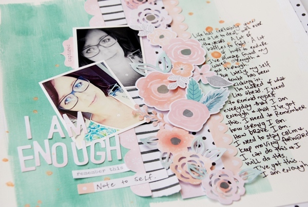
I am enough
by Tammy Klingner

Happy Friday!!!!
 
This week I again had a play with Cocoa Vanilla's Love Always Collection.
Such a stunning range.
This is my third layout using this range.
 
The die cut ephemera pack has so many lovely flowers in it.
I especially love the silhouette style ones. 
Gorgeous!
 
 
I began by adding gesso to my cardstock, and then adding some acrylic paint.
I wanted to create an ombre effect, so I did this by just adding a bit more white to my paint, as I moved across the page.
 
 I love the greens and corals in this range, so they are the colours I focused on.
 
I added some flicks of coral paint, and then began to layer up  a few strips of patterned paper.
I added the flowers on top of these strips, using foam tape for some to create extra dimension.
 
I then simply added my title to the left hand side and my journaling to the right hand side.
 
 
I love journaling on my layouts. 
Giving a voice to your beautiful pieces of art that you spent hours on is so important.
When I journal on my layouts, I tend to just write from the heart. 
I don't do a rough draught, I just let the words flow.
For me, I think that is the key - don't overthink it, just let the words fall onto the page.
It's very therapeutic.
 
I'll be back again soon!
 
Products used:
White Bazzill
Gesso
Cocoa Vanilla Love Always Paper - Class Act
Cocoa Vanilla Love Always Die Cut Ephemera
Cocoa Vanilla Love Always Stickers
Cocoa Vanilla Love Always Alphabet Stickers
Cocoa Vanilla Love Always Paper - Twin Set
Heidi Swapp Colorshine - Georgia Peach
Tim Holtz Distress Paint - Lucky Clover
Dylusions Paint - White Linen
 
Photobucket

Wednesday, October 26, 2016

Love this Boy with Crate Paper Cool Kid by Fiona Johnstone

Hello everyone

Back with another layout created using Crate Paper's Cool Kid range. Gotta love a fab boy range like this one, totally my current fave!

This week; Love this Boy
I've created my background with some Dylusions Paint before adding several paper layers from the collection. I've torn some of my papers for extra texture.  Once the papers were down, I added some texture stamping to the background and tying in together by going over the papers. 

Next up some embellishments, the Love this sticker is silver foil with black writing from the Cool Kid foil accents sticker sheet. And some cork Thickers, love these. 


and some Flutterby Designs Flair, stickers a Kaisercraft tag and some pieces from my stash. 

Till next week
Fiona
x

Photobucket
Products Used

Crate Paper Cool Kid paper - Adventure 
Crate Paper Cool Kid paper - Boys Club
Crate Paper Cool Kid paper - Wild One
Crate Paper Cool Kid paper - Hooray
Crate Paper Cool Kid - Foil Accent Stickers
Crate Paper Cool Kid Small Star Embellishment
Dylusions Paint - Vibrant Turquoise
Kaisercraft Texture Stamp - Chevron
Kaisercraft Texture Stamp - Tiny Dots
Kaisercraft Shipping Tag
Flutterby Designs Flair Design 42
American Crafts Thickers

Monday, October 24, 2016

Amy Tangerine Oh Happy Life layout by Rachel Lowe - Totally Fun:


Hello again everyone.

Well today I have a fun and super cheerful layout to share with you using the super
 cheerful collection Oh Happy Days by Amy Tangerine.

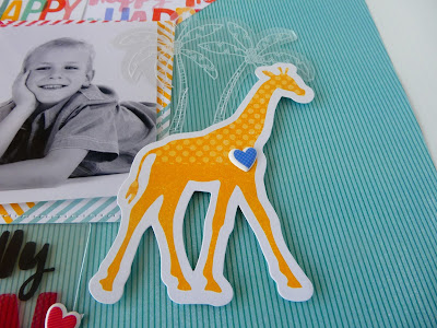
I knew that this layout had to have the Giraffe and owl somewhere on it (because I love them) so this was my starting point. More often than not it is the photo that dictates the theme of my layout but not today!!


I wanted the Happy paper to remain a feature and so it didn't get lost I cut it diagonally in
 half and contrasted with the green. and then added some sewing to create visual interest.


I matted my photo on the multi coloured paper to ensure it did not get list.
 Again I added some sewing to add definition.

As you can see this is where I incorporated my owl by tucking it under the
 photo and adding some sewing.


And now for the fun bit, I secured down the acetate palm trees with it layering over my photo.
 I then attached the Giraffe with foam tape over the palm trees and finished off with a
 puffy sticker heart.


I then tucked under my photo matt the 'Totally Fun' acetate, added some sewing and the
 heart and Giraffe puffy sticker to make a feature.


I then added the 'everyday Happy journal card and added some sewing to the top of the
card. I finished off with adding a die cut heart on my photo completed with a camera
puffy sticker.


This layout makes me 'Happy' and it compliments my photo perfectly.

Thank you for stopping by today and I hope you like this layout as much as I loved creating it.

Have a happy week, until the next time.

xXx


Photobucket

Friday, October 21, 2016

Hello Happy Place
by Tammy Klingner

Well it's Friday already, which means it's my turn to share.
 
Today I have a layout created with a bit from here and a bit from there!
I often do that......
It starts with whatever leftovers are on my desk, and pretty much builds from there.
 
 
This week I had 2 papers on my desk which I hadn't used when I had used Kaisercraft's Boho Dreams Range. 
The black and white stripe is my fave from that range, but as I had gone with a softer, muted layout, I hadn't used it.
Also I had quite a lot of the black and white feather paper left, and I was itching to cut some of those feathers out.
 
I knew with the bold blacks and whites I wanted to go bold! And I wanted to go colour!
So I gathered my Dylusions Ink Sprays - the colours are gorgeously bright!
 
I began by spritzing my page, and letting it run a little down the page. I purposely kept it to one side of my paper, knowing this was where I would add my photo.
 
 
I then cut out some feathers. 
I dug out lots of 2 Crafty Chipboard for this one - the dreamcatcher, a feather, my title and my small word.  I coated these with gesso, before painting them in Dylusions Paint, and adding Dylusions Ink Spray too!!
I wish I'd thought to take a photo of my hands!! Oh they looked awesome!
Such messy fun!
 
After this I went through all my leftover embellishments, hunting for bold and bright colours.
I found heaps!!
I added these behind my photo. 
 
I then added the chipboard and feathers, to the page.
I really wanted them to look like they were trailing down my page - kinda like a dreamcatcher.
 
 
I just LOVE THIS page!
I love the subject matter (my scrap space, complete with wine glass! LOL)
I'm so happy with how it turned out.
 
I love mixing ranges.....you never quite know what you are gonna get!
 
Products used:
Kaisercraft Boho Dreams Paper - Feathers
Kaisercraft Boho Dreams Paper - Young
Bella Boulevard Valentina Paper = Love
Kaisercraft Finders Keepers Paper - Treat
Photo Play Run Like a Girl Stickers
Simple Stories Carpe Diem Frames
Fancy Pants Happy Place Ephemera
Pink Paislee Fancy Free Ephemera
2 Crafty Hello
2 Crafty Christmas Mini Word Set 2
2 Crafty Dreamcatchers
2 Crafty soft feather set
Dylusions Paint - Fresh Lime
Dylusions Paint - lemon zest
Dylusions Ink Spray - Lemon Zest
Dylusions Ink Spray - Polished Jade
Dylusions Ink Spray - Postbox Red
Dylusions Ink Spray - Fresh Lime
Gesso
 
Photobucket

Wednesday, October 19, 2016

New Hat - Cocoa Vanilla Make a Wish by Fiona Johnstone

Hello everyone

Another page created with the gorgeous Make a Wish collection. It is just so pretty. 

New Hat


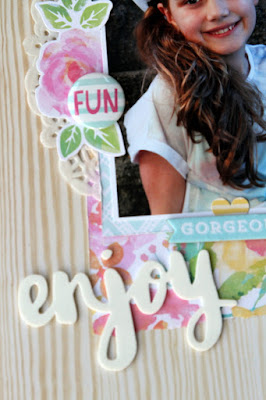
I adore this gorgeous woodgrain pattern in the collection, it makes a perfect base. I've teamed this up with other papers in the collection and added a doily for some extra layers. 


Lots of delightful embellishments including the title alphabet letters stickers, chipboard embellishments, ephemera and flair. 


I've finished the layout with a little subtitle using some fab foam thickers - which also includes the heart sticker. 

Hope you've been inspired to check out this collection.
Till next week

Fiona
x
Photobucket

Product List

Cocoa Vanilla Studio Make a Wish paper - Fresh Cut
Cocoa Vanilla Studio Make a Wish paper - Hip Hooray
Cocoa Vanilla Studio Make a Wish paper - Daydream
Cocoa Vanilla Studio Make a Wish - Alphabet Stickers
Cocoa Vanilla Studio Make a Wish - Chipboard Accent Stickers
Cocoa Vanilla Studio Make a Wish - Ephemera
Cocoa Vanilla Studio Make a Wish - Flair Buttons
AC Oh Happy Life Thickers Wild White Foam Phrase thickers
Doily
Asstd Enamel Dots

Monday, October 17, 2016

You're kind of a Big Deal layout by Rachel Lowe:

Happy Monday everyone!

Today I have a layout using the very cool Alex collection by Bella BLVD.

How cool are these colours and paper designs!!!

These designs and colours would suite an older boy.

I loved the challenge of getting such different designs to work on a layout.

I loved how this turned out and is so striking on the white.


Firstly I chose the two daily details journal cards and these became my theme. I added some sewing details and a foam taped heart so they did not appear flat and uninteresting.


Once I had chosen my paper design I set about layering them in the most visually interesting way.


Again to create a 3D effect I covered various 2Crafty Triangles with the green paper. I then randomly attached over the paper pieces.


I have used three of the designer clips (which are made of plastic and are just gorgeous) adding to create a feature and to emphasis my photo.


There are so many great die cuts you could many more to this layout depending on your theme, I finished off with the green music head phones.


I had so much fun creating this layout and I love it's vibrancy and contrasts.
This is such a great 'boy' collection and a 'must have'.

Thank you for stopping by today.

Have a wonderful week and see you next week.

xXx


Bella BLVD Alex - paper beast mode
Bella BLVD Alex - paper daily details
Bella BLVD Alex - paper killing it
Bella BLVD Alex - paper pieces
Bella BLVD Alex - paper turn it up
Bella BLVD Alex - tabbies
Bella BLVD Alex - designer clips
2Crafty Chipboard multi pack triangle set
Bazzill cardstock/white 12x12


Photobucket

Friday, October 14, 2016

Cherish
by Tammy Klingner

Hi Everyone
 
Todays layout is created using more of the Cocoa Vanilla Love Always Collection.
 
 
For this layout, I focused on the greys and mints in the collection.
I really wanted this layout to have lots of negative space as I loved the background paper.
 
So my focus was to just work in one corner. 
Oh it's a challenge to be so restrained!!
 
 
 I swiped some gesso in the top right corner, where I wanted my photo to be.
I then flicked some greys and mint paint.
I then added all the mint and grey embellishments I could find, and began layering. 
Aren't those die cut leaves just stunning!
 
I love the butterflies.
 I wanted them to surround my photo, so I added a 2Crafty Chipboard Frame to enhance this.
 
 
I then added the gorgeous title, painting it black, and then adding a touch of silver to it.
 
I love the softness of the layout.
I usually scrap with bold colours mixed with black and white, so this one was a big change for me.
 
I'll be back next week.
 
Products used:
Cocoa Vanilla Love Always Paper - Twin Set
Cocoa Vanilla Love Always Paper - Note to Self
Cocoa Vanilla Love Always Paper - Lovely Things
Cocoa Vanilla Love Always Die Cut Ephemera
Cocoa Vanilla Love Always Stickers
Cocoa Vanilla Love Always Flairs
2 Crafty Chipboard Frame - Circle Dot Frame
2 Crafty Fine Word Set 1
Heidi Swapp Colorshine - Seafoam
Dylusions Paint - Black Marble
 
Photobucket

Wednesday, October 12, 2016

Awesome with Crate Paper Cool Kid & You Make me Happy with Photo Play Real Genius by Fiona Johnstone

Hello everyone

Back again with another layout created with the Cool Kid collection - totally LOVE this range!! 

Awesome

 
I've created a stamped background for this layout, using the Spellbinders Window Stamp, some ranger inks, then some Kaisercraft texture stamps. Lots of paper layers, just so much of this goes so perfectly together it's easy to use a little bit of it all. 
 
 
Some simple embellishments to follow the visual triangle created with the stamping.
 

and the title Awesome from the sticker sheet, love the funky lettering. 


And my second share is using Photo Plays Real Genius papers:

You Make me Happy

 
I've tried something different here with my background, i've splashed different colour inks on, then wet the cardstock and let them blend together a bit. Then I have added some extra ink splashes once that was dry. 
 

I used a combination of spray and inks to get the title colour. The chipboard frame
 has been lightly inked on the edges only.


Lots of cogs for embellishing from a few different collections, even some old brads,
 and cool wooden dots. 


Thanks for stopping by
till next week
Fiona
x
Photobucket
Products Used:
Awesome
Crate Paper Cool Kid paper - Boys Club
Crate Paper Cool Kid paper - Brothers
Crate Paper Cool Kid paper - Handsome
Crate Paper Cool Kid paper - Champ
Crate Paper Cool Kid Foil Accent Stickers 
Spellbinder Stamp Set - Window 2
Kaisercraft Just Landed Wooden Flourish Pack Travel
Star Wood Veneer
Shipping Tag
Kaisercraft Texture Stamp Grid
Kaisercraft Texture Stamp Number
Tim Holtz Distress Inks

You Make Me Happy
Photo Play Real Genius paper - Stripe
Photo Play Real Genius paper - Apple Banner
Photo Play Real Genius paper - Math
2Crafty Chipboard - You Make Me Happy title 
2Crafty Chipboard - Messy Square
Kaisercraft Lucky Dip Wooden Flourish - Cogs
Prima Junkyard Findings Metal Cogs
Dylusions Ink Spray - asstd

Monday, October 10, 2016

Let's Go layout by Rachel Lowe:

Happy Monday everyone.

It wasn't that long ago I was travelling Italy and when I got home I promised myself I would scrap at least some of the hundreds I took unfortunately I am only up to photo number three from our trip.

The new collection by Shimelle Go Now Go is a perfect for travel photos, totally love the wooden buttons, die cuts and puffy stickers. The paper designs and colours make it super easy to get those travel photos scrapped.

This photo is taken in Florence and not a bad photo when I was relying on my hubby to master my camera under pressure!!


I chose the map of the world paper as my background because I just fell in love with the wood grain against the dark blue.

I added a border strip to the top of this page finished off with two puffy stickers.


I firstly cut out the month July and put in the dates we travelled and set about embellishing the card to make it a feature of my layout. 

I have used the die cut plane and suitcases. I have foam taped the cases and added a wooden flair and puffy sticker heart. I have sewn on the die cut plane and wash strip on the July journal card to add more texture.

I then created my Italy word from the sticker book and added another puffy sticker heart under the word Italy.

I finished off the feature by adding another wooden flair on the 'July' card.

I added the scallop border under my photo and chose a sentiment sticker and attach over the border chipboard piece. To add more interest to to the border strip I added two more puffy hearts.


I then took the 'let's Go!' tag and tucked it under my photo and added a wooden flair.
To create the feel of a sky at the top of the world map paper I added a sky blue paper strip (1/2 inch), sewing with alternate zig zag and straight stitching finished off with the cloud wooden flair.


I really wanted to keep my photo the main focus of this layout and did not want to lose the effect of the map background paper and hence why I created one main embellishment feature. I will add some writing to the journal card later.

When you have a background paper with a pattern you do not want to lose/cover placement and small embellishment clustering is what will make it work.

I hope this has inspired you to get your travel photos out and give this layout a go.

See you next week with Bella BLVD in the spotlight.

xXx


Shimelle Go Now Go - ephemera
Shimelle Go Now Go - luggage-puffy-stickers
Shimelle Go Now Go - Here paper
Shimelle Go Now Go - Chipboard stickers
Shimelle Go Now Go - Plans paper
Shimelle Go Now Go - wood buttons


Photobucket